
Advertising and Creativity, A Practical Way to Make Ads People Remember

Most teams treat advertising and creativity like two separate jobs: one team “does the numbers,” another team “makes it look good.” In practice, the strongest ads come from combining both into one repeatable system: creative that earns attention and makes the next action obvious.
Table of contents
What “advertising and creativity” really means (and what it is not)
Example: turning one product feature into 6 testable ad angles
Key takeaways
Good advertising and creativity is not “more ideas,” it is a system that turns ideas into testable messages and formats.
Use a consistent 5-part structure (Hook, Problem, Proof, Offer, Next step) to reduce guesswork and speed up iteration.
Judge creative with criteria tied to outcomes: attention, comprehension, trust, and action.
What “advertising and creativity” really means (and what it is not)
In day-to-day work, advertising and creativity is the discipline of turning a marketing objective (sell, trial, subscribe, book a demo) into a message people understand quickly, presented in a format that fits where they see it (feed, stories, search, display).
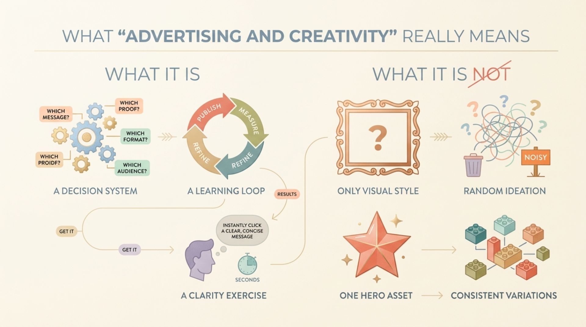
What it is
A decision system: which message, proof, and format to show to which audience.
A learning loop: you publish, measure, and refine what people respond to.
A clarity exercise: the viewer should “get it” in seconds.
What it is not
Only visual style: beautiful layouts can still fail if the message is unclear.
Random ideation: “let’s brainstorm 50 concepts” often produces noise instead of usable tests.
One hero asset: most brands win through consistent variations, not one viral swing.
If you want a deeper companion piece focused on execution systems, this guide on creative ads design pairs well with the framework below.
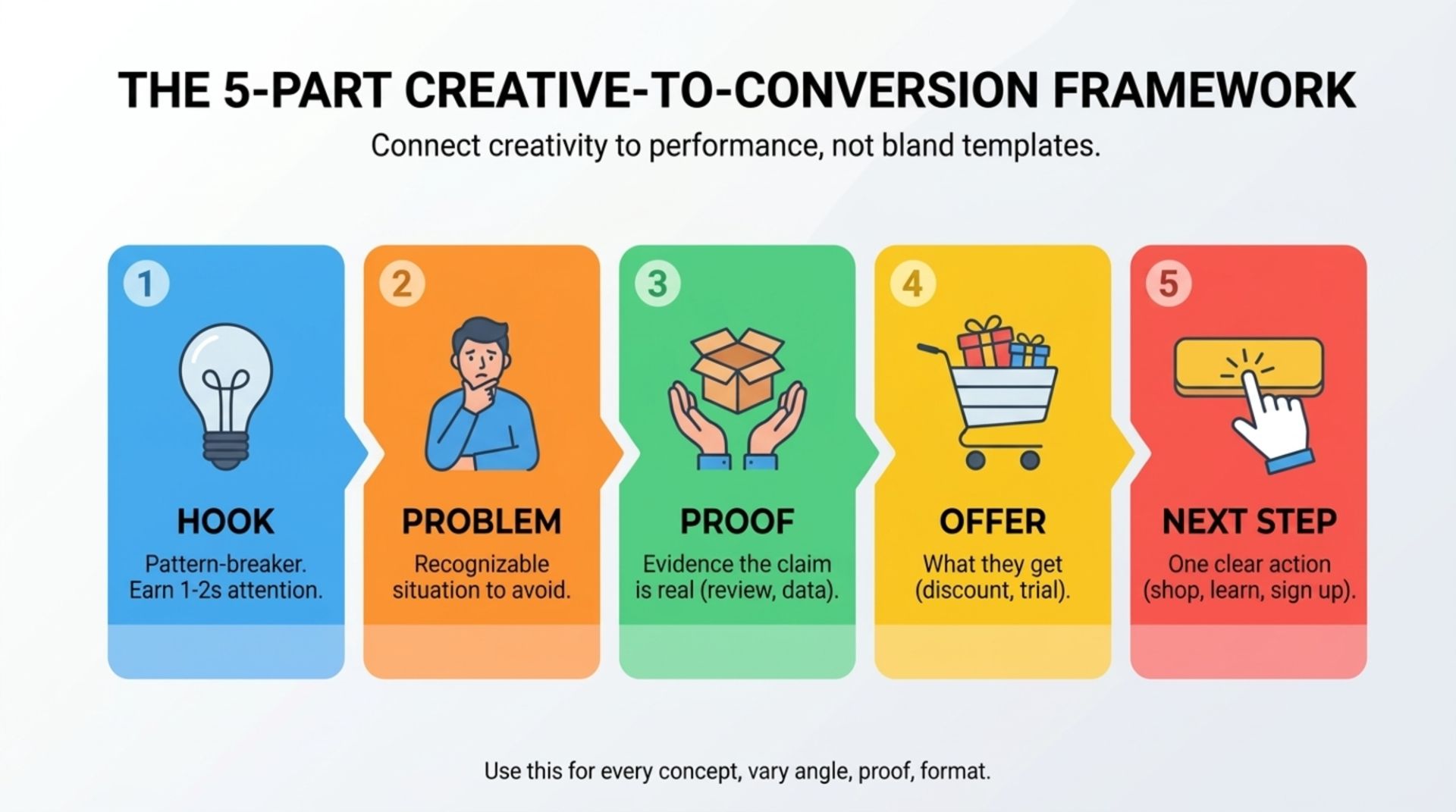
The 5-part Creative-to-Conversion Framework
Here is a practical way to connect creativity to performance without turning your ads into bland templates. Use this structure for every concept, then vary the inputs (angle, proof, format).
Hook: a pattern-breaker that earns 1 to 2 seconds of attention.
Problem: the situation the viewer recognizes (or wants to avoid).
Proof: evidence that your claim is real (demo, data point, review, mechanism, comparison).
Offer: what you want them to do and what they get (discount, free trial, bundle, consultation).
Next step: one clear action (shop, learn, subscribe, book).
Criteria to score each part (so it is not subjective)
Hook score: Would a cold viewer stop? (yes/no, then why)
Problem score: Is the audience instantly identifiable? (specific vs generic)
Proof score: Is the proof observable? (demo beats adjectives)
Offer score: Is the value concrete? (what changes for them)
Next step score: Is there only one primary action? (no competing CTAs)
This is where advertising and creativity becomes operational: you are not guessing what “good” is, you are scoring and iterating.
Benefits of creative ads, mapped to real metrics
“Be more creative” is not helpful unless you can connect it to outcomes. Use the table below to translate creative improvements into what you can actually measure in-platform.
Creative benefit | What changes in the ad | What you should watch |
|---|---|---|
Higher attention | Stronger hook, clearer first frame, better contrast | Thumb-stop proxies (3-second views, view rate, scroll depth where available) |
Better comprehension | Less visual clutter, simpler copy hierarchy, clearer product context | CTR to landing page and on-page engagement (bounce rate, time on page) |
More trust | Specific proof (UGC, reviews, demonstrations, guarantees) | CVR, add-to-cart rate, lead form completion rate |
More efficient testing | Modular system with reusable layouts and controlled variations | Time to launch variants, number of learnings per week |
On the research side, two useful references for why clarity and usability matter (even in ads) are Nielsen Norman Group guidance on scannable content and Baymard’s findings on e-commerce UX friction (which often shows up as drop-offs after the click) from Baymard Institute research.
Note: these sources do not “prove” one creative choice wins in every account. They help you make higher-probability decisions about clarity, hierarchy, and friction reduction.
A quick creative audit checklist before you spend more
Before you increase budget or launch 20 new variants, run this audit on your current winners and losers. It takes 10 minutes per ad and usually reveals obvious fixes.
Creative audit checklist (printable)
Message in 5 seconds: Can someone explain the offer after one view?
Single focal point: Is there one dominant element (product, result, headline), not five equal ones?
Proof present: Is there a demo, review, statistic, or mechanism explanation?
Audience call-out: Does the ad signal who it is for (use case, scenario, pain point)?
One CTA: Is the next step obvious and singular?
Format fit: Does it look native in the placement (safe margins, text size, pacing)?
Variation control: If you are testing, did you change only one variable (hook or proof or offer)?
If your team needs a more structured approach to planning variants across channels, this article on creative advertising design provides a system for keeping creative consistent while still testing.
Example: turning one product feature into 6 testable ad angles
Here is a concrete way to apply advertising and creativity without relying on “big ideas.” Pick one feature, then write angles that change why it matters.
Starting point
Feature: “Our bottle keeps drinks cold for 24 hours.”
Turn it into 6 angles (each becomes a separate Hook + Proof)
Outcome angle: “Still cold after your whole shift.” Proof: time-lapse or thermometer check.
Problem angle: “Stop buying iced coffee twice a day.” Proof: cost comparison graphic.
Scenario angle: “Beach day, no warm water.” Proof: UGC clip in sun + quick temp check.
Objection angle: “Yes, it fits in a car cupholder.” Proof: on-screen fit demo.
Mechanism angle: “Double-wall vacuum seal explained in 10 seconds.” Proof: simple cutaway illustration.
Social proof angle: “10,000+ 5-star reviews for temperature hold.” Proof: review montage (ensure it is accurate).
How to test without chaos (simple rule)
Keep the layout the same for the first round.
Change only the angle (headline + first 2 seconds).
When one angle wins, create 2 to 3 new versions by changing only the proof format (demo vs review vs graphic).
This kind of controlled testing is the fastest way I have seen teams learn what their customers actually respond to, because you can attribute performance shifts to a specific change.
If your ads rely heavily on social placements, you may also like this breakdown of creative facebook ads and how production choices affect iteration speed.
FAQ
Is creativity in advertising just about being funny or surprising?
No. Humor and surprise can help, but creativity is better defined as finding a clear, compelling way to present value in a specific context. Many high-performing ads are straightforward: strong proof, clear benefit, and an easy next step.
How many ad variations should I test at once?
Start small: 3 to 6 variations where only one variable changes (usually the angle). If you test too many differences at once (angle, layout, offer, audience), you learn less because you cannot isolate what caused the lift.
What proof works best in creative ads?
Observable proof tends to outperform vague claims: demos, before/after with context, UGC showing real use, and specific reviews. Choose proof that is easy to verify and hard to misunderstand.
How do I know if my ad problem is creative or targeting?
Run a simple diagnostic: keep the same audience, but test 3 different angles using the same layout. If results vary meaningfully, the constraint was creative. If results are uniformly weak, you may have an offer, landing page, or audience mismatch.
If you want help turning this framework into launch-ready assets (hooks, variants, and consistent layouts) without building a full in-house studio, Tetta Space can support fast, on-brand creative production for paid social and campaigns. Bring one product and one goal, and start by requesting a clear scope you can act on.

Written by Celina Tran
I write about the space where design meets e-commerce. At TETTA, I work with brands to build social templates, scroll-stopping ads, and mascots people remember. Here, I share practical tips on visual consistency and creative workflows, and on how small teams can look big without an in-house design department.

Creative Ecommerce Website Design That Sells Without Feeling Salesy
Learn creative ecommerce website design principles, patterns, and a practical framework to make your store memorable, trusted, and easier to buy from.

Creative Advertising Design Starts With a Clear Decision System
Learn how creative advertising design turns product messages into clear, memorable ads with a practical framework, checklist, and examples.

Creative for Digital Marketing That Actually Improves Ad Results, A Practical Framework
Learn creative for digital marketing with a practical framework, examples, and checklists to build ads that earn attention and convert.
