
Creative Ads Design, A Practical System for Making Ads People Actually Notice

Creative ads design is not “making something look nice.” It is the discipline of turning a message, an offer, and a product into a visual that gets understood in under 2 seconds and earns the next action (a click, a view, or a purchase). If your ads look polished but performance is flat, the issue is usually not aesthetics, it is signal clarity: the viewer cannot quickly tell what this is, why it matters, and what to do next.
Table of contents
Key takeaways
Good creative ads design optimizes for comprehension speed first, then persuasion.
Use a repeatable structure (hook, proof, offer, brand, action) so you can test ideas, not random layouts.
Review ads with checklists and measurable criteria (thumbstop, CTR, CVR) to avoid subjective feedback loops.
What Creative Ads Design Means (In Performance Terms)
In paid social, your creative competes against everything else in the feed. So creative ads design is best defined as engineering attention and understanding in a constrained space.
A useful way to think about it is in three jobs your design must do, in order:
Interrupt: earn the first glance (pattern break, motion, contrast, unusual framing).
Explain: make the product and outcome obvious (what it is, for whom, why now).
Convert: reduce friction and make the next step feel safe (proof, offer clarity, recognizable branding).
When you treat creative ads design as a system, it becomes easier to produce consistent iterations. That is also where your creative for digital marketing stops being a “one-off” and starts being an asset you can scale.
The 5-Part “Clarity Stack” Framework
Use this framework to design (and critique) any static ad. It is intentionally simple so you can apply it in minutes.
1) Hook (0 to 1 second)
Goal: make the viewer pause long enough to process the message.
Design criteria: one dominant visual element; high contrast between focal object and background; minimal competing text.
Common hooks: bold benefit headline, surprising comparison, problem visual, before/after, or a strong human/character face.
2) Product and outcome (1 to 2 seconds)
Goal: answer “what is this?” and “what do I get?” without reading paragraphs.
Show the product clearly (or the result it creates) at a glance.
Use a benefit-led line, not a feature pile. Example: “Cooler sleep in 3 minutes” communicates faster than “gel-infused foam.”
Use icons or micro-labels for constraints: “2-day shipping,” “machine washable,” “vegan,” etc.
3) Proof (trust in 1 glance)
Goal: reduce “this looks like an ad” skepticism.
Proof options: star rating, review count, press mention, UGC-style quote, certification, or a specific number (only if you can substantiate it).
Rule: proof must be visually subordinate to the hook, but readable without zooming.
4) Offer and urgency (only if it is real)
Goal: make the decision easier now, not later.
Make the offer explicit: “20% off bundles” is clearer than “sale.”
Avoid fake scarcity. If urgency is not real, use a reason-to-believe instead (warranty, guarantee, free returns).
5) Action and brand (recognition + next step)
Goal: help the right people remember you and know what to do.
CTA can be a button style element or a line like “Shop colors” or “See sizes.”
Branding should be consistent: logo placement, colors, type, and any recurring elements (like a character). If you use characters, consider whether a mascot in advertising can improve recognition across variations.
Creative Ads Design Checklists for Faster Reviews
These checklists are designed for quick “pass/fail” reviews so your team can ship more tests without endless subjective debates.
The 10-point feed checklist (static ad)
Single focal point: can you point to the one thing you want noticed first?
Readable headline: is the main line readable on a phone at arm’s length?
Product clarity: would a stranger know what you sell in 2 seconds?
Outcome clarity: is the benefit explicit (not implied)?
Proof present: at least one trust element exists.
Offer explicit: if there is a promo, is it clear and quantified?
CTA visible: do you clearly suggest the next step?
Brand consistent: colors and type match your system.
Safe margins: no critical text near edges (platform UI can cover it).
Variation-ready: could you swap the hook or headline in under 5 minutes?
Decision table, what to change first when performance is weak
Symptom | Likely issue | Change first |
|---|---|---|
Low thumbstop (people scroll past) | Hook is not visually distinct | Increase contrast, simplify composition, change first frame or main image |
OK thumbstop, low CTR | Message is unclear or not compelling | Rewrite headline to a single benefit, add specificity (time, result, audience) |
Good CTR, low conversion rate | Mismatch between promise and landing experience | Align ad claim with landing content, reduce ambiguity, add proof, refine offer |
Conversions but low AOV | Value not framed | Test bundle framing, add price anchor, show what is included |
If the landing page is the bottleneck, it is worth reviewing your ecommerce site design for trust and clarity issues that ads cannot fix.
A Concrete Example, Turning a Weak Ad Into 3 Testable Variations
Scenario: a DTC skincare brand runs a static ad with a pretty product shot and the text “Glow naturally.” CTR is low. The ad is aesthetically fine, but the claim is generic and the viewer does not know what changes, for whom, or why this product is different.
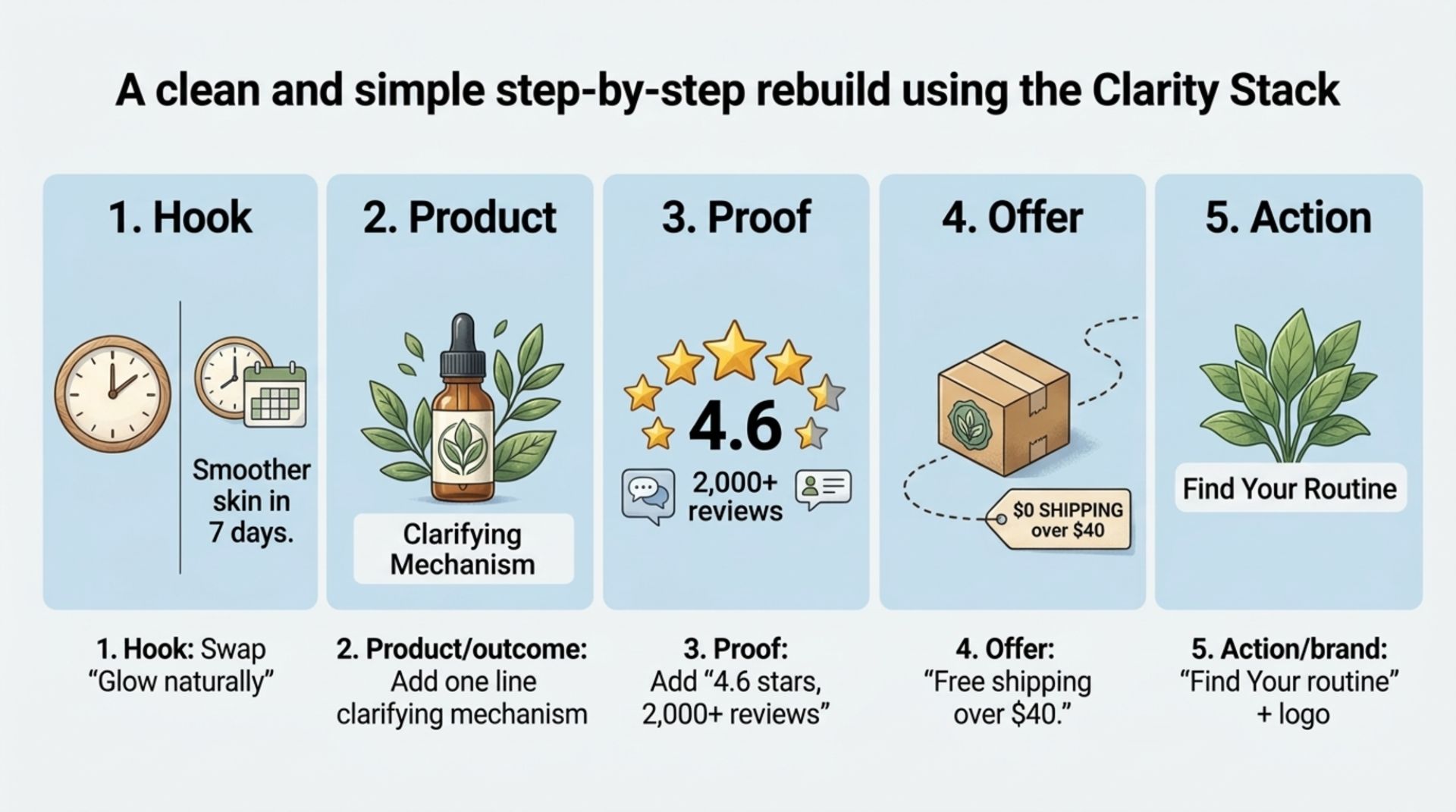
Step-by-step rebuild using the Clarity Stack
Hook: swap “Glow naturally” for a specific outcome, “Smoother-looking skin in 7 days.”
Product/outcome: add one line clarifying mechanism, “Barrier-friendly retinol alternative.”
Proof: add “4.6 stars, 2,000+ reviews” (only if true and verifiable).
Offer: if real, “Free shipping over $40.” If not, skip.
Action/brand: “Find your routine” plus consistent logo placement.
Now create 3 variations (change one variable at a time)
Variation A (benefit test): “Smoother-looking skin in 7 days” vs “Less redness, same routine.”
Variation B (proof test): reviews badge vs a short UGC quote (“My skin stopped reacting”).
Variation C (visual test): product-only hero vs product + texture smear vs product-in-hand (more human context).
This is the core advantage of a system-driven creative ads design process: you do not need to reinvent layouts each time. You are running controlled tests on the parts that matter.
How to Measure If Your Creative Improved (Without Guessing)
Creative ads design improvements should show up in metrics, but you need to match metrics to the part of the ad you changed. Use this simple measurement map:
Hook changes (image, contrast, first-frame): track thumbstop metrics such as 3-second views (video) or scroll-stopping proxies like CTR lift vs baseline.
Message changes (headline, benefit, offer): track CTR and outbound click rate, plus on-site bounce rate.
Trust changes (proof, guarantees): track conversion rate and cost per purchase.
For benchmarking and methodology, Meta publishes guidance on what drives performance and how to structure tests; cross-check your approach against Meta’s ads creative guidance.
Limitations: attribution windows, mixed audiences, and learning-phase volatility can mask creative effects. Try to hold audience, placement, and budget constant when comparing variations.
Common Failure Patterns and Fixes
Failure pattern 1: “Too much text, but still unclear”
Fix: delete, then rebuild around one sentence. Use a strict hierarchy:
1 headline (benefit)
1 support line (mechanism or differentiator)
1 proof element (badge or quote)
Failure pattern 2: “Looks on-brand, but every ad looks the same”
Fix: keep the brand system stable but rotate the hook types. A stable template can support variety. If your team also produces organic content, borrow the same system thinking used in social media post design so ads and posts feel related without becoming repetitive.
Failure pattern 3: “Great ad, weak landing conversion”
Fix: align promise to page in under 5 minutes by checking:
Same primary claim above the fold
Same offer terms
Proof near the top (reviews, guarantees)
Clear product details (shipping, returns, sizing)
If your pages need a deeper rebuild, a structured brief for custom ecommerce web design can prevent disconnects between ad promise and on-site experience.
FAQ
What is creative ads design in simple terms?
Creative ads design is the process of designing ad visuals (and the supporting text hierarchy) so people quickly understand the product, the benefit, and what to do next. The goal is fast comprehension and trust, not decoration.
How many ad variations should I test at once?
Start with 3 to 5 variations where each one changes a single major variable (hook, message, proof, or visual). Testing too many changes at once makes it hard to learn what caused the result.
Should I prioritize branding or performance in creative ads design?
Prioritize comprehension and action first, but keep brand assets consistent (logo placement, type, color) so winners build memory over time. You can usually do both by keeping a stable template and rotating hook concepts.
Do I need motion design for better results?
Not always. Many accounts scale with static ads if the hook and message are strong. Use motion when it supports understanding (demo, transformation, social proof), not as decoration.
If you want to apply this creative ads design system quickly but do not have in-house production bandwidth, Tetta Space can help turn a brief into campaign-ready ad variations with consistent on-brand execution. Start by outlining your Hook, Outcome, Proof, Offer, and CTA, then share that direction to request a scope.

Written by Celina Tran
I write about the space where design meets e-commerce. At TETTA, I work with brands to build social templates, scroll-stopping ads, and mascots people remember. Here, I share practical tips on visual consistency and creative workflows, and on how small teams can look big without an in-house design department.

Creative Advertising Design at Scale: Hire, or Subscribe?
Compare creative advertising design via in-house teams vs studio subscriptions. See setup time, scalability, cost-per-output, and a 3-step switch plan.

Creative Facebook Ads vs Traditional Product Shoots: Which Fits Lean E-commerce Teams?
Compare creative facebook ads vs traditional product shoots with a decision table, cost-per-output benchmarks, and a 3-step migration playbook.