
Best Mascot Design Is a System, Not a Sketch: A Buyer’s Evaluation Playbook

Most teams searching for best mascot design are not actually shopping for “a cute character.” They are trying to buy a repeatable brand asset that can hold up across ads, packaging, email, and product UI without breaking consistency or timelines. This playbook gives you concrete evaluation criteria, a scoring rubric, and a deliverables checklist you can use to shortlist designers or studios with confidence.
- What “best mascot design” should achieve (in business terms)
- The 6-part evaluation rubric (score any mascot before you buy)
- Deliverables checklist: what to request so the mascot is usable
- A practical benchmark: stress-test the mascot across real placements
- Decision table: pick the right mascot approach for your brand
- Common failure modes and how to prevent them
- How to run the project in 7 days (without endless revisions)
- Evaluate mascots like a system: recognition, range, scalability, brand fit, production efficiency, and legality.
- Do not approve a mascot without a stress test across 6 placements (including tiny sizes and high-contrast).
- Request deliverables that keep you fast later: poses, expressions, vector files, usage rules, and an asset library.
What “best mascot design” should achieve (in business terms)
A mascot earns its cost when it reduces the effort required to communicate your brand repeatedly. In practical terms, best mascot design should deliver three outcomes:
- Faster recognition: the character is identifiable in under 1 second even when cropped or small.
- Repeatable storytelling: you can express multiple messages (helpful, urgent, celebratory, instructional) without redesigning the character each time.
- Production leverage: your team can reuse the same asset library across formats with minimal new illustration work.
If you are still deciding whether a mascot is the right asset at all, read brand mascot basics first. This article assumes you already want one and need to pick the right design partner and deliverables.
The 6-part evaluation rubric (score any mascot before you buy)
Use this rubric to compare concepts from different designers. Score each category 1 to 5, then total to 30. Anything under 22 usually needs rework before production.
| Criterion | What “5/5” looks like | How to test it quickly |
|---|---|---|
| Recognition | Silhouette and face read instantly; distinct from common archetypes | Show for 1 second, then ask “what brand vibe was that?” |
| Range (expressions/poses) | At least 5 emotions and 3 body poses without off-model drift | Request happy, concerned, excited, “pointing,” and “holding product” |
| Scalability | Works at 24px and on a billboard; clean shapes, controlled detail | Shrink to favicon size; print in 1-color |
| Brand fit | Matches tone, category expectations, and audience sensibilities | Map to 3 brand traits (eg, “bold, helpful, premium”) and check alignment |
| Production efficiency | Can be reused in templates, ads, packaging with minimal redraw | Ask for modular parts (hands, props, accessories) |
| Legal/originality safety | Clearly original; no “looks like X” risk; clean ownership terms | Do a quick reverse image search and competitor scan |
Why this matters: teams often approve a mascot based on “likability,” then discover it fails in small sizes, cannot emote, or takes too long to produce new variations. The rubric forces best mascot design decisions into testable criteria.
Mini scoring example (with context)
Imagine a DTC sleep brand wants a friendly character for paid social. A fluffy, detailed creature might score high on likability, but if its face becomes a blur at 48px in a carousel, it will score low on scalability and recognition. The higher-scoring alternative might be simpler with a distinct silhouette and fewer interior details, even if it is less “illustrative” up close.
Deliverables checklist: what to request so the mascot is usable
Many mascot projects fail not because the concept is weak, but because the deliverables do not support real marketing production. Use this checklist in your brief and contract.
- Master files: editable vector source (AI/SVG) plus layered files for future edits.
- Core set: 3 to 5 expressions and 3 to 5 poses (not just facial swaps).
- Scale variants: simplified “small-size” version (fewer details) for icons and thumbnails.
- Color system: primary palette + 1-color and 2-color versions for printing constraints.
- Usage rules: spacing, background do/don’t, minimum size, and what not to distort.
- Asset library: organized exports (PNG/SVG) with consistent naming, plus a quick index.
- Optional motion readiness: separated limbs/face components for animation handoff.
If your team needs help defining the concept before deliverables, the article how to make a mascot pairs well with this evaluation checklist.
A practical benchmark: stress-test the mascot across real placements
Before you approve “final,” run a stress test across placements you actually ship. This is where best mascot design reveals itself, because the same character can succeed in one environment and fail in another.
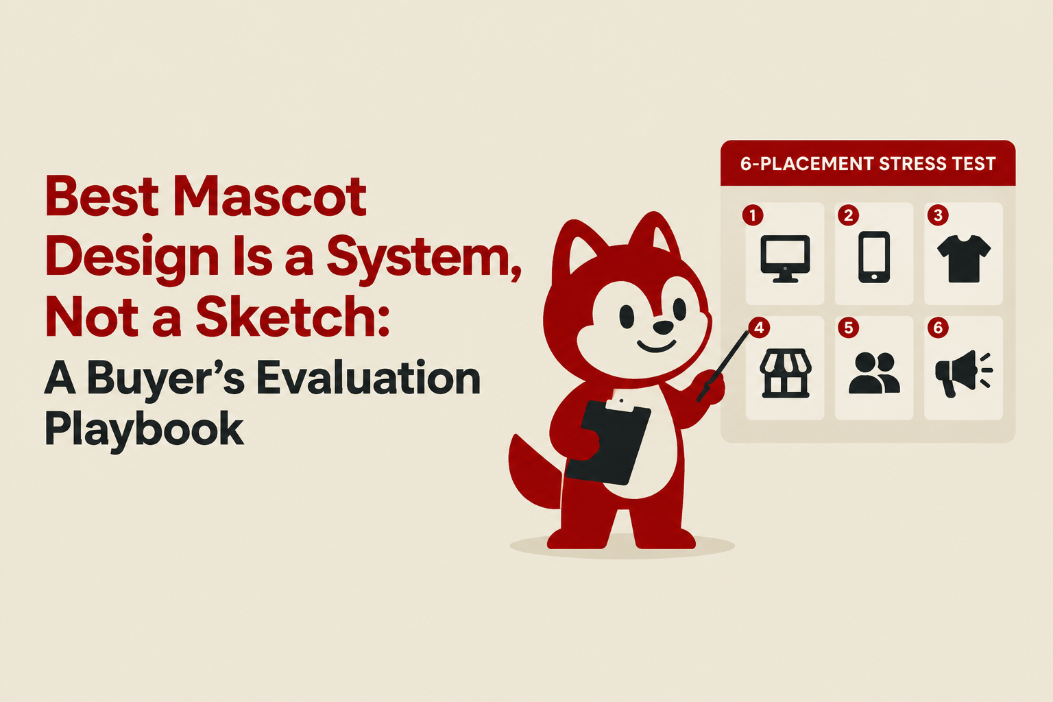
The 6-placement stress test (copy/paste)
- 48px thumbnail (ad preview or small UI tile): does the face still read?
- Story format (9:16): can the mascot support a headline without clutter?
- 1-color print (packing insert stamp): does it retain identity?
- Busy background (UGC-like ad): does it need an outline or simplified version?
- Crop test (only head/upper body): is it still recognizable?
- Prop interaction (holding product or pointing at CTA): do hands and angles look natural?
If any placement fails, do not “patch” with new illustration each time. Ask for a system change: simplified variant, thicker outlines, stronger silhouette, or fewer interior details.
Decision table: pick the right mascot approach for your brand
Not all mascot styles perform the same. Use this decision table to choose an approach aligned to your constraints and channels.
| Your reality | Recommended mascot approach | Why it tends to work |
|---|---|---|
| You ship lots of paid social variants weekly | Simple, modular mascot with accessories | Fast iteration, consistent recognizability at small sizes |
| You rely on packaging and print inserts | High-contrast linework, strong silhouette, 1-color capable | Print-friendly and cheaper to reproduce consistently |
| You want brand storytelling and community content | Character with broader emotional range and a “world” | More scenarios without feeling repetitive |
| You need it mostly as a logo mark | Iconic head or bust design with strict simplification | Better legibility in small placements |
For teams specifically considering a mascot as part of their identity system, the mascot logo brand framework helps you avoid blending “logo needs” with “campaign illustration needs” in a way that weakens both.
Common failure modes and how to prevent them
Here are the most common issues I see in mascot approvals, plus prevention steps you can enforce in review.
1) “It’s cute, but we can’t use it”
- Symptom: only one pose, no props, no layout guidance.
- Prevention: require the deliverables checklist plus the 6-placement stress test.
2) Off-model drift across new illustrations
- Symptom: every new pose looks like a different character.
- Prevention: request a model sheet (proportions, key angles, line weights) and a small-size variant.
3) Too detailed for performance channels
- Symptom: details collapse in ads, carousels, thumbnails.
- Prevention: approve at 48px first, not at full size. This is a simple but reliable filter for best mascot design.
4) Originality risk
- Symptom: feels “inspired by” a well-known character archetype or competitor.
- Prevention: do a competitor scan and reverse image search; clarify ownership and exclusivity in writing. For more on the business side of consistent character usage, see mascot marketing systems.
How to run the project in 7 days (without endless revisions)
This schedule keeps momentum while protecting quality. It also reduces “taste debates” because each day has a concrete decision artifact.
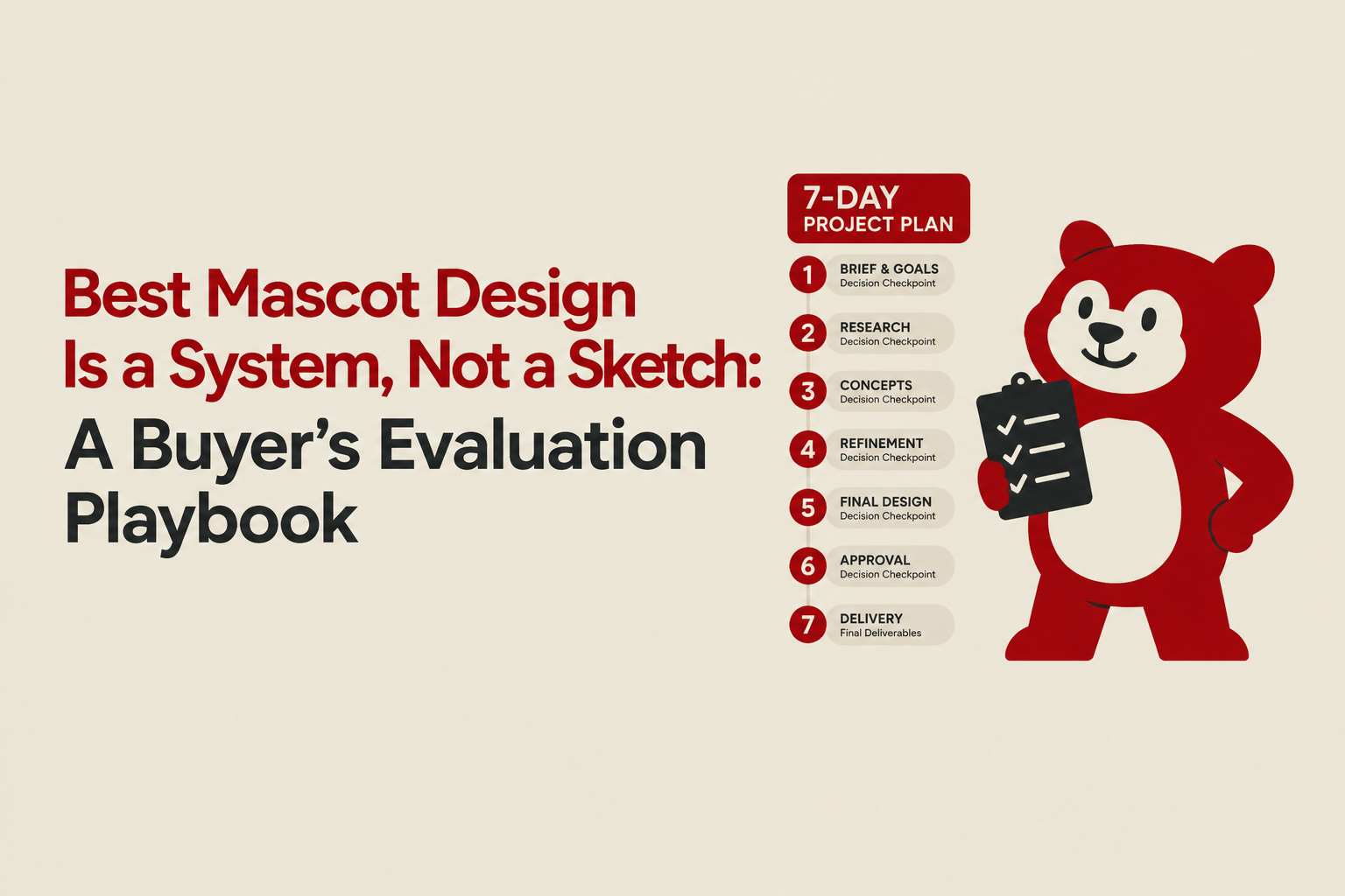
- Day 1: Direction lock (1 page): audience, 3 brand traits, do/don’t references, required placements.
- Day 2: 2-3 rough concepts: silhouette-first exploration plus face options.
- Day 3: Pick 1 concept: score using the 6-part rubric and choose the highest total.
- Day 4: Build the system: expressions, poses, small-size variant, color variants.
- Day 5: Stress test: run the 6 placements, then revise only what fails.
- Day 6-7: Package deliverables: organized exports, model sheet, usage rules.
Tooling note: if your team collaborates in Figma, it helps to keep approvals and handoff clean. See Figma’s official platform for sharing files and commenting workflows.
FAQ
If you want help executing this process quickly, Tetta Space can design a mascot system built for campaigns and repeatable placements (not just a one-off character). Send your brief and you can get a clear scope within 24 hours.

Written by Celina Tran
I write about the space where design meets e-commerce. At TETTA, I work with brands to build social templates, scroll-stopping ads, and mascots people remember. Here, I share practical tips on visual consistency and creative workflows, and on how small teams can look big without an in-house design department.
Best Business Mascots, Ranked by What Actually Builds Brand Memory
Best business mascots aren’t just cute. Use this criteria-first ranking to evaluate iconic mascots and choose the right mascot system for your brand.

Mascot Logo Brand Decisions Made Clear With a Practical Framework
Learn how to build a mascot logo brand with a practical framework for strategy, design, consistency, and memorable customer recognition.

Mascot in Advertising, A Practical Playbook for Brands That Want Recall, Not Just Reach
Learn how to use a mascot in advertising with a practical framework, examples, and a rollout checklist to improve brand recall and consistency.
