
Social Post Design Without the Rework, A Template System You Can Repeat

Social post design breaks down in a predictable way: every new post becomes a one-off, reviews turn into subjective debates, and production slows as soon as you need variety. The fix is not “better designers” or “more inspiration.” It is a simple system: reusable templates built on clear rules, so your team can produce faster while staying consistent.
- What Social Post Design Really Means (Beyond Making It Look Good)
- The Hidden Cost of “One-Off” Posts
- A 5-Step Social Post Design System You Can Implement This Week
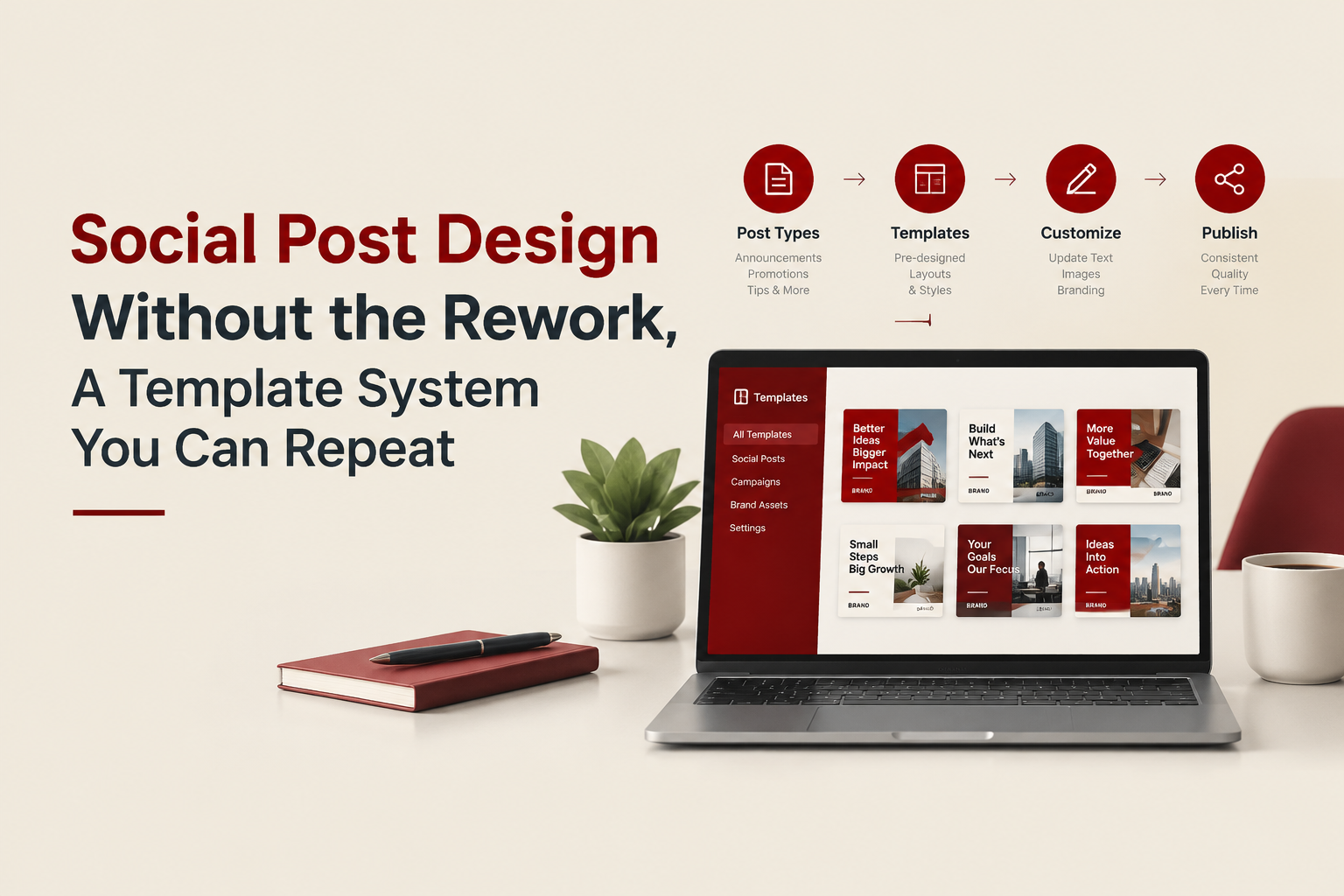
- Template Anatomy, The 9 Building Blocks That Make Posts Fast and Consistent
- Proof It Works, A Mini Benchmark and a Before-After Example
- Tools and Handoff, How to Keep Templates Usable
- Good social post design is a repeatable production system, not a collection of one-off visuals.
- Templates reduce rework by turning subjective feedback into objective checks (spacing, hierarchy, contrast, specs).
- A small set of 8 to 12 templates, paired with clear rules, covers most content needs without making your feed look repetitive.
What Social Post Design Really Means (Beyond Making It Look Good)
In practice, social post design is the craft of turning a message (offer, insight, product, story) into a layout that is readable in-feed, recognizable as your brand, and easy to produce repeatedly. If you only optimize for aesthetics, you get pretty posts that are hard to scale.
Use this definition test. If a post design is “good,” it should pass all three:
- Clarity in 1 second: the main point is obvious without zooming.
- Brand recognition without the logo: colors, type, spacing, and layout cues feel like you.
- Repeatability: the team can make 10 variations without redesigning from scratch.
If you want a deeper dive into scaling layouts with a system (not ad hoc artboards), see social media post design.
The Hidden Cost of “One-Off” Posts
Teams often feel the pain (slow output), but miss the mechanism (too many micro-decisions per post). Here are the most common failure points and what they cost you.
Cost checklist, what to look for in your last 10 posts
- Rework loops: “Make it pop” feedback leads to 2 to 4 extra rounds because there is no agreed visual rule.
- Inconsistent hierarchy: headings, prices, and CTAs change size and position, reducing scanability.
- Brand drift: colors and font substitutes creep in as people copy past old files.
- Format debt: every time you need a carousel, story, or ad crop, you rebuild layouts.
If 3 or more are true, you do not have a design problem. You have a system problem. This is exactly where social templates help, because they remove decisions without removing creativity.
A 5-Step Social Post Design System You Can Implement This Week
This framework is designed for teams that need output now, not a full rebrand.
Step 1: Define your “post types” (not formats)
Formats are Instagram post, story, LinkedIn square, etc. Post types are what your audience expects. Pick 6 to 8 to start:
- Product highlight
- Promo/offer
- Social proof/testimonial
- Educational tip
- Comparison or “vs”
- Announcement (launch, restock, event)
- UGC feature
- Behind-the-scenes
Each post type becomes 1 to 2 templates. That is how you reach a manageable library of 8 to 12 templates.
Step 2: Set 4 non-negotiable rules (so feedback becomes objective)
Write them down and put them in the template file as a “Rules” frame. Example rules:
- Hierarchy rule: one headline only; headline occupies 15 to 25% of canvas height.
- Spacing rule: 8-point spacing increments (8, 16, 24, 32).
- Type rule: max 2 font families; max 3 sizes per post.
- Contrast rule: body text must pass WCAG AA contrast for normal text when possible (especially for informational posts). Reference: WCAG standards and guidelines.
Step 3: Build templates from constraints (grid + content modules)
Start with a grid (for example: 12-column grid, 64 px margins on 1080x1350). Then define modules you can swap:
- Headline block
- Subhead block
- Product/visual block
- Price/offer badge
- CTA strip
- Trust marker (rating, press mention, guarantee)
This modular approach is what makes social post design scalable: you recombine modules instead of re-inventing layouts.
Step 4: Add “variant rules” to prevent repetition
For each template, define 3 variants the team can use without redesign:
- Visual placement: left, right, full-bleed
- Background system: solid, gradient, texture
- Accent system: underline, badge, border
Write these as toggles in the template (“Turn accent ON/OFF”). This is how templates stay fresh.
Step 5: Create an export and naming standard
This step is boring and saves hours. Use a naming convention like:
- Template: Promo-01 / Testimonial-02 / Tip-03
- Exports: Promo-01_IG-Feed_1080x1350_v1, Promo-01_Story_1080x1920_v1
Make the standard part of your review checklist, so you stop losing assets in Slack threads.
Template Anatomy, The 9 Building Blocks That Make Posts Fast and Consistent
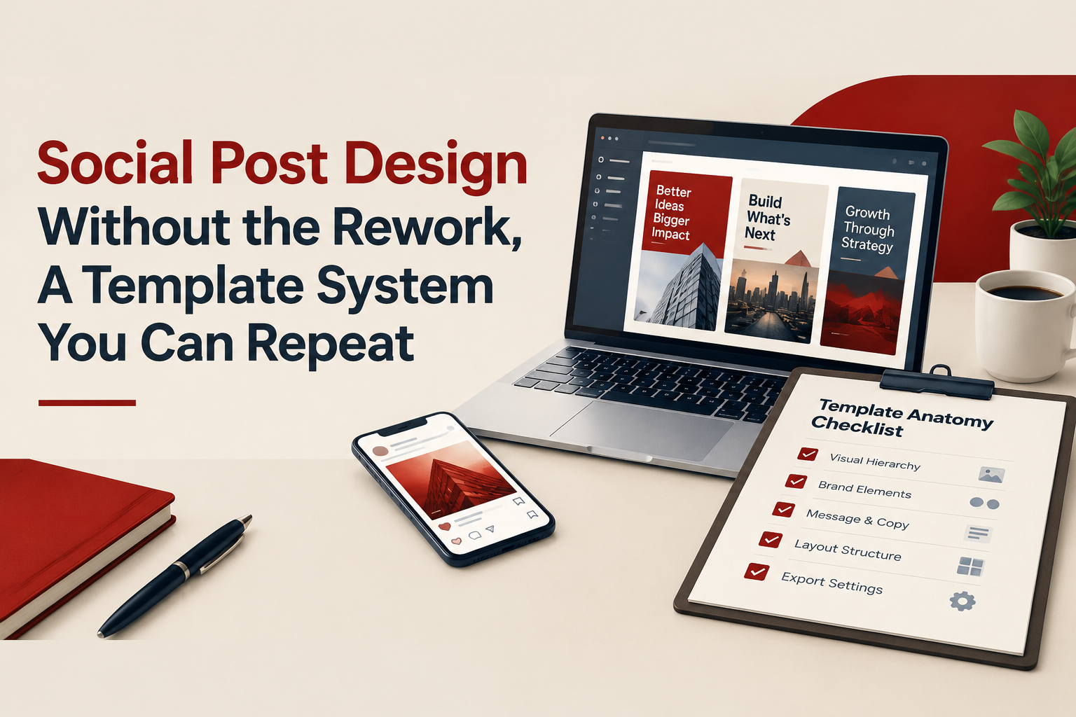
If you are building or auditing a template library, use this checklist. A template that is missing 3 or more items will create rework later.
- Canvas sizes: at least 1080x1350 and 1080x1080; add story if you publish there.
- Grid and margins: visible guides and locked margins.
- Type scale: predefined H1, H2, body, caption styles.
- Color styles: primary, secondary, background, accent, and “warning/price” colors.
- Component library: badges, buttons, icons, rating stars, separators.
- Image rules: safe area for product images; shadow rules; corner radius standards.
- Copy limits: max characters for headline and body (example: headline 35 to 55 chars).
- Accessibility checks: contrast and minimum font sizes for mobile readability.
- Usage examples: 2 finished samples per template (so new teammates do not guess).
For teams that publish heavily on Instagram, it can help to formalize this around a repeatable instagram post layout approach so your grid, spacing, and hierarchy do not change post-to-post.
Proof It Works, A Mini Benchmark and a Before-After Example
You do not need complex analytics to see whether your social post design system is working. Track two numbers for the next 2 weeks:
- Production time per post (minutes): from brief to export.
- Review rounds per post: how many times it comes back.
A simple benchmark table
| Metric | One-off design workflow | Template system workflow |
|---|---|---|
| Decisions per post | High (layout, type, spacing, components are re-decided) | Lower (layout and components are pre-decided) |
| Time to create a variation | Often similar to a new post | Usually faster (swap copy, image, accent) |
| Review feedback quality | Subjective (“make it pop”) | More objective (contrast, hierarchy, spacing, spec compliance) |
| Brand consistency risk | Higher (drift over time) | Lower (styles and rules are embedded) |
Concrete example (realistic scenario)
Scenario: an e-commerce team needs 12 posts for a seasonal promotion: 4 product highlights, 4 offer reminders, 4 testimonials.
- Without templates: each category becomes a new layout discussion, and designers rebuild badge styles, headline placement, and image treatments repeatedly.
- With templates: the team uses three templates (Product, Offer, Testimonial) with 3 preset variants each. The designer focuses on the campaign message and imagery, not rebuilding structure.
The outcome you want is not “all posts look the same.” The outcome is that the rules stay the same while the message changes.
Tools and Handoff, How to Keep Templates Usable
Templates only help if the team can actually use them. Two practical recommendations:
1) Choose one primary editing tool and document the decision
- If non-designers will publish weekly, consider a tool that supports safe editing via components and styles.
- If designers will own production, prioritize strong components, variants, and libraries.
Most teams end up deciding between Figma and Canva. If you are weighing those trade-offs for social media creatives, align the choice with who edits and how often.
2) Build a “handoff frame” inside every template file
Add one page called “How to use” with:
- Do/Don’t examples (2 each)
- Copy length limits
- Export settings
- Where to find assets (logos, icons, product images)
If you publish carousels regularly, separate templates for cover, content slide, and CTA slide will reduce inconsistent pacing. A dedicated set of carousel templates for instagram can also help you standardize typography and slide rhythm.
FAQ: Social Post Design
If you want help turning this framework into a finished, on-brand template library your team can reuse, Tetta Space can design a social template system (editable in Figma or Canva) and deliver organized exports ready for publishing. Bring one upcoming campaign and request a custom quote, and you will get a clear scope within 24 hours.

Written by Celina Tran
I write about the space where design meets e-commerce. At TETTA, I work with brands to build social templates, scroll-stopping ads, and mascots people remember. Here, I share practical tips on visual consistency and creative workflows, and on how small teams can look big without an in-house design department.

Best Ecommerce Sites in 2026: 12 Benchmarks You Can Copy and Score
See what the best ecommerce sites do differently. Use a 12-point scorecard to benchmark UX, trust, speed, and checkout before you redesign.

Mascot Marketing That Actually Sticks, A Practical System for Building Recognition
Learn mascot marketing with a practical system, what it is, why it works, and how to use it across ads, social, and packaging without being gimmicky.

Creative Advertising Campaigns That Actually Convert, A Practical Shortlisting Framework
Evaluate creative advertising campaigns with a repeatable scorecard: concept, proof, production speed, and test plan to pick winners faster.